The “Comfort Women” Justice Coalition logo contest generated a plethora of very creative entries. A judging panel selected the top six designs and the final balloting was opened up to CWJC’s executive committee. Judges were presented with the image entry and the designer’s intention. Although no winner was selected, CWJC is proud to present the three finalists who all received an $100 compensation award for their time and dedication. The three finalists were: Kenji Liu (Los Angeles, CA), Gabriel Ndlovu (Gaborone, Botswana), and Ephimotswe Whitley Tshireletso (Lobatse, Botswana).
Congratulations to the finalists and thank you to everyone who submitted their entry!
Kenji Liu, Finalist
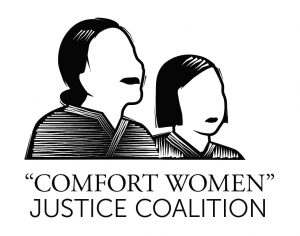
“My concept is to center the trafficked girls and women in the logo, to give a “face” to the people whose stories are denied by the Japanese government. The woman on the left represents a present-day former “comfort woman” who is stepping up to tell her story with dignity. She is acting as an ally to the girl on the right, who represents her younger, enslaved self. Together, they are the most important part of the justice coalition. Their bond also represents the bond of all partners in the justice coalition.”![]()
![]()
Gabriel Ndlovu, Finalist
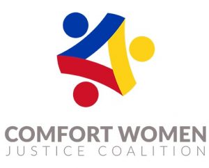
“The logo shows joining of hands which communicates unity. The message is ‘UNITED WE STAND.’ Where there is unity, there is strength and peace. Women all over the world need strength to fight as one for justice from sex trafficking and violence against them today. This logo encourages women from all faces of the earth to stand up and fight for their rights as human beings and say ‘NO TO ABUSE.’ The joining of hands in the logo also symbolizes the element of care or caring for one another. Women should look out for one another and fight each other’s battle. In a nutshell, develop sympathy towards those that are facing abuse. It is every women’s mandate to look out for one another, ‘UNITED WOMAN STAND STRONGER.’”
Ephimotswe Whitley Tshireletso, Finalist
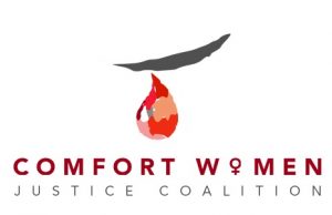
“Within the logo there is a tear, used to resemble the suffering of the “Comfort Women” during their enslavement. The tear is designed with shades of red, a colour that resembles blood, the blood shed of the other women who died during the wartime captivity. The tear is of a “Comfort Women” crying, crying for peace and justice. Usually a woman’s cry is followed by her resilience, she begins to bounce back, gets up, and fights for her justice.”
Thank you again to all the designers who submitted to this important contest. We also thank those who shared the logo contest competition and helped spread the knowledge on the “Comfort Women” movement.


